Snowballs and Rockets.
They may not seem to go together, but they serve as a useful analogy to describe the two techniques for attracting qualified traffic to your ecommerce site.
And they help explain why I use both techniques as part of a sustainable, long-term online marketing strategy.
First though, let’s look at each technique and how they help me get people into the marketing funnel.

And it works… immediately… as long as it doesn’t run out of fuel. Turn off the tap, and it crashes back to earth… immediately.
Because for a rocket – Gravity is the enemy.
And in my analogy, Gravity is our universal constant. That one thing that exerts a force on everything else.
Gravity can represent time, or market competition, or banner blindness, or pesky algorithms, or all of the above.
And the only antidote is more money – whether it’s a bigger ad spend or better creative or cheaper long-tail keywords.
And no matter what you spend, someone else is always spending more.
Booking.com spends north of a billion US dollars on Google Adwords alone… per quarter.
That’s how competitive the online travel space is and how much it costs to keep their Rockets going.
Trivago, Expedia, et al would have to spend similar amounts just to compete with Booking for ad space at the top of Google’s SERPs (Search Engine Results Pages).
But whatever your market, the competition for premium ad real estate is going to be fierce if the traffic is there.
It’s like the Sydney property market at its peak… tons of desperate bidders driving up the price of properties at countless auctions.
Except the product being auctioned is keywords.
Keywords that also attract organic traffic.
Which leads us to…
Technique 2: The Snowball
The Snowball is content marketing.
Content marketing works a bit differently to paid ads.
It targets specific audiences, like paid ads do, but it offers an exchange of useful, engaging content – or information – for a person’s attention (and trust).
In other words, organic traffic.
And like advertisers, content marketers must ensure the content connects that person with the brand in a meaningful way that ultimately drives profitable customer action.
They just may not do it as fast as an ad can. They’re playing the long game.
Now let’s get back to the Snowball. To get the Snowball moving, you only need to start small.
Shape a nice bit of content into a ball loaded with the right keywords (and held together with some good old technical SEO) and let it roll away in the direction you want it to go – where the audience is.
“Our niche is a bit more technical than most and I was skeptical about outsourcing content creation, but CopySmiths proved me wrong. Not only was the content well researched and written, but the entire process from initial specification to the edits was smooth and professional. The number of edits required was minimal, and the turn around for the edits was quick. If you’re looking for content creation at scale, I’d recommend CopySmiths.” — Todd Ariss, GoDarkBags.com
Collecting enough content to make a nice snowball costs money – but once it’s rolling, even slowly, there’s nothing that can stop it (provided it’s heading in the direction you want it to go).
You see, for your Snowball, Gravity is its friend. BFFs 4Ever.
Over time, your Snowball grows bigger and travels faster, gathering more and more free organic traffic as it goes.
Because science.

This is why good content that keeps pulling in the traffic is called evergreen content. The traffic just doesn’t die off (like paid traffic does once the flow of cash is turned off).
So, What About Visual Content Marketing?
Visual content marketing simply describes the way my team creates useful, image-based content that helps people trust our clients’ products and services.
We develop content that builds Expertise, Authority and Trust – E-A-T – by providing solutions to people’s problems.
In other words, information that matches the user intent of the search query – whether it’s informational, navigational or transactional.
For example, let’s say someone is trying to work out what size workwear they need. They’re female, and the only size guide they can find at their workplace is for men.
First, though, let’s pause to consider the possible UI/UX in this hypothetical scenario:
- The person is using their smartphone and searches using voice commands either via an assistant like Siri or using the microphone option in Google search.
- The person types the search query into either a mobile device or desktop.
“I’m really impressed at the quality of content that CopySmiths produces. My niche is boring, but CopySmiths is very creative and consistently comes up with unique angles to address the topic.
The quality of writing is very good — but the best thing is it’s written for the reader in mind. They use tables, lists, graphics, comparisons, etc. knowing that every reader consumes content differently.” — Alan Marek, PartCatalog
From Voice to Visual: It’s still about User-Intent
Let’s assume they use the voice option to search by tapping the microphone icon next to the search bar on their phone screen.
In which case, they might ask, “How do you measure women’s workwear?”
I know Google’s algorithm seems to like the simple, easy-to-follow list format presented as a solution to a particular query.
So in that case, Google is likely to deliver a top organic result that provides a simple step-by-step guide to getting the right measurements.
Like this type of text-based content:

But what if the answer is actually not specific to the female body-type, which presumably means Google couldn’t easily find a more relevant answer.
Frustrated, the person searching may then resort to typing in a variation of the search query spoken earlier.
But this time by adding a qualifier such as “size chart”.
Because the user is thinking visually. It’s what we do.
For example, “womens workwear size chart” – which IMO is more likely what you’d type as opposed to speak out loud.
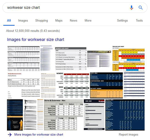
I think in that scenario the SERP is likely to include image-based results in addition to the text-based results (because size charts are highly visual, like all charts or graphs or Venn diagrams, etc.).
Like this:

Notice the little figures in the bottom left next to the charts?
You can’t discern the chart from the thumbnail but you can instantly recognise the human figure and your eye is naturally drawn towards it.
Images that appear in these blocks are all nice, free organic links.
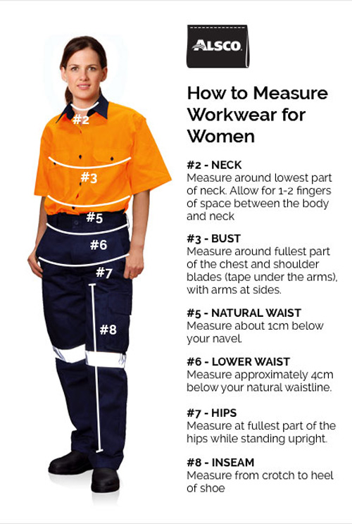
We recently produced this image for our client for this precise reason, combining an image of a human figure, colour, and short chunks of formatted text as a numbered list.

And it does pretty well appearing in SERPs for a bunch of related long tail keywords.
It helps that the rest of the page it appears in is nicely optimised for the topic.
Our thinking is, a visual guide is always going to be more effective than words only.
How much more effective? A 1982 study says 323% more effective.
I reckon those researchers ended up working for IKEA.
Our theory is the above graphic works particularly well because the combination of image and text is almost irresistible.
Think about it – the human brain processes images much faster than it processes text – maybe not 60,000 times faster as is often cited – but still a LOT faster. Probably around 43% faster.
So when we see a nice clean, colourful image highly relevant to our search, our brains almost immediately recognise the connection and make our eyes hover over that visual stimulus for a fraction longer than other less-compelling options.
And then the brain registers the accompanying text – in this example broken up into easily digestible chunks.
The expectation is that this text is going to be highly contextual – and relevant to the image, which the brain has already established as a good match with our user intent – namely, how do you measure workwear for women?
Most of the image-based results are generally tables – a pretty typical format for a “size chart” – but as thumbnails they are not immediately big enough for our eyes to ascertain their detail (well, my eyes anyway).
So it’s easy for a splash of colour and an organic shape like a human figure to catch the eye for just one fraction of an instant – but that’s enough if that image then offers just enough visual information to hold the brain’s attention.
And at this point it is still very much visual processing that is occurring – even when it “sees” the text – the brain simply registers it as words which are presumably highly relevent to the topic at hand.
And then you get the click, which quickly confirms that the text is indeed information that supports the image’s promise of a solution.
Which increases dwell time and improves your page’s ranking over time.
The snowball effect.
So, in my mind it’s a symbiotic relationship between what we see and what we eventually read that contributes to our decision to invest time and effort in investigating a particular search result.
And it’s earning that decision that drives me to keep searching for new ways of using visual content.
Does Content Marketing Really Help Ecommerce Sites Sell More Stuff?
Creating useful visual content like the above example has enabled us to drive enough organic traffic to that client’s website to generate more than $1 million revenue from online sales in just ten months.
That result represented a 1059% ROI per month for our client.
And that content continues to generate revenue without our client having to spend any more money.
It continues to attract organic traffic simply by existing.

How good is that?
