
A call-to-action (CTA) is probably derived from the phrase ‘call to arms’, which is an expression that has been used ever since the 1700s. Call to arms was used to summon people to fight together for a common cause, to take action, in other words – to do something.
In the modern, digital world, the whole point of the call-to-action is exactly the same. It is that short and direct sentence or a phrase that invites your readers to act.
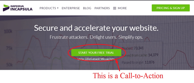
A call-to-action can be a sentence in your text, or it can be in a form of a button on the page, like the CTA buttons on the Incapsulia home page:
It should prompt the visitors of a website to take a desired action. It could be anything from downloading an ebook, signing up as a subscriber, attending an event, buying or checking out a product, getting a free coupon, and many others.
Buy the best toy 50% off if you act now!
Get the track shoes pro hikers swear by.
Try the secret snacks even superstars love!
Discover the shampoo only the pros use!
Get a free lipstick with your next order today only!
A call-to-action won’t always be to purchase a product or service, although it may lead people in that direction.
Download your free copy of our new ebook
Start your free trial right now
Get your answers from our friendly staff
A call-to-action is one of the fundamental elements of lead generation, bringing website visitors to the next step that will engage them further with a company. You have the power to strengthen that connection by optimising your CTAs.
The Importance of a Compelling Call-To-Action
You must have seen the words “click here” or “contact us today” a million times while browsing the Internet. They have lost all their value and ability to inspire you to actually click there or contact those people. That is because they are not compelling CTAs.
However, a call-to-action is nothing if not compelling.
Your words need to make the reader feel that flutter in their heart. They need to feel a bit of that fear of missing out on something amazing if they are not doing what the CTA told them to do.
Get the mascara Hollywood pros swear by
Will always get more clicks on a makeup selling eCommerce store than
The first call-to-action promises revealing a secret, giving the customer the access to an amazing product that is used only by the best of the best. It evokes curiosity and makes people want to learn more.
On the other hand, the second call-to-action does nothing of that. It just invites people to click. Why would anybody want to click anything? Just because they are told to do so? It just doesn’t work that way.
Only if there is a hint of mystery, excitement or intrigue, will the readers click on that link or hit that button. That is why the compelling CTA is important.
The CTA should be compelling enough to get the reader to act immediately. They should click through to engage further with the website, get in touch or fill in the enquiry form right then.
If the action is not taken immediately, it probably never will be and the entire opportunity is wasted. A visitor will just remain a visitor and not generate a lead or a sale.
The CTA is the link between the visitor and a lead.
Core Components of a Compelling Call-To-Action
Before you attempt to craft an effective and enticing CTA, ask yourself what you want your visitors to do after they read your content.
Even though CTAs have changed over the past few years, their goal and their key components remained the same.
A Clear Value Proposition
Click-through(s) will be more forthcoming when there is clear value for the customer in the product or service being offered.
A value proposition is a statement that
- explains how your product solves customers’ problems or improves their situation (relevancy)
- delivers specific benefits (quantified value)
- tells the customer the benefits and value of buying from you instead of buying from your competitors (unique differentiation).
A clear value proposition should set you apart from the competition.
Here are some good examples:
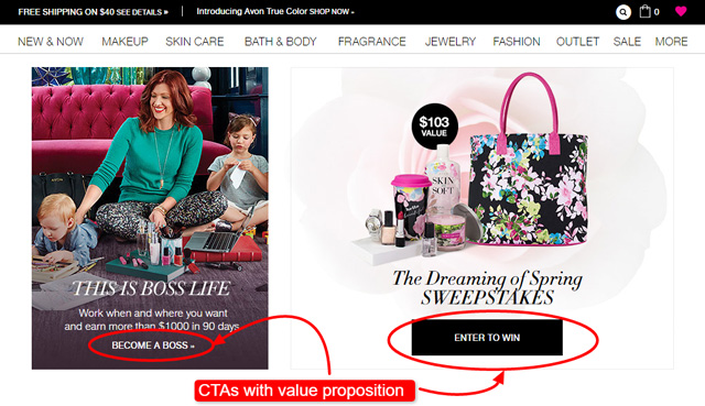
1. Avon
There are two calls-to-action on this page and both of them offer interesting value propositions. The first one is to “Become a boss” which invites the change for the better for a customer. It promises the improvement of their situation.
The second CTA calls for the customers to “Enter to win” which definitely means some benefits for those who click.
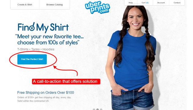
2. Uberprints
Uberprints is an eCommerce store offers its shoppers an option to customise shirts and create their own design. Their call-to-action states “Find The Perfect Shirt” which solves the precise problem that a customer has – they want a shirt that they cannot find anywhere, so they want to create their own.
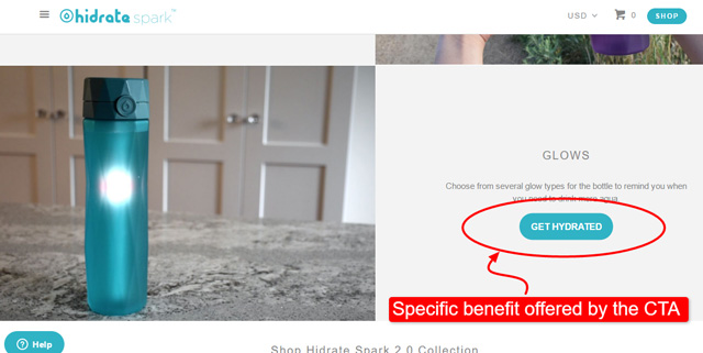
3. Hydrate Spark
Hydrate Spark company offers smart water bottles that remind people that they need to drink a certain amount of water in a day. People who are interested in this product are looking for a way to stay hydrated. That is just what this CTA promises – it solves a ‘problem’.
4. Maggie Sottero
Maggie Sottero is an eCommerce business that designs and sells wedding gowns. Since choosing a wedding gown is a matter of creating the perfect wedding experience for the bride, the call-to-action responds well to the need that the potential clients have – choosing the right style.

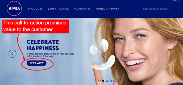
5. Nivea
Nivea has a very straightforward call-to-action that promises a very desirable value – happiness. Their button goes well with the rest of the content on the page. “Celebrate happiness” is the ‘motto’, so clicking on “get happy” comes as a logical thing to do.
On the other hand, here are some examples of BAD calls-to-action that fail to deliver relevancy or add value for the customer:
Call us
Click here
Submit
View collection
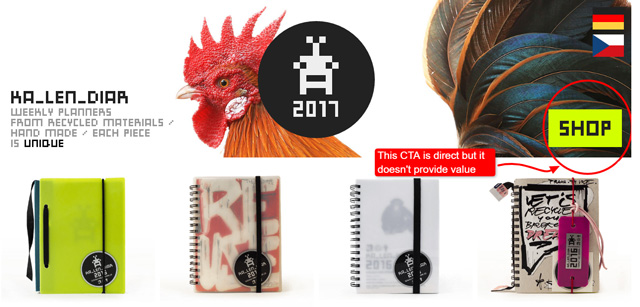
Kalendiar’s calls the clients to “shop.” But that’s it. There is no relevancy there and there is no value to it. Even a simple “shop now” would be better, though not ideal, as it would add a notion of time sensitivity.
Actionable Language
Use verbs or action words that will engage visitors, motivate them to take specific actions, and elicit an immediate response from them.
These are GOOD examples:
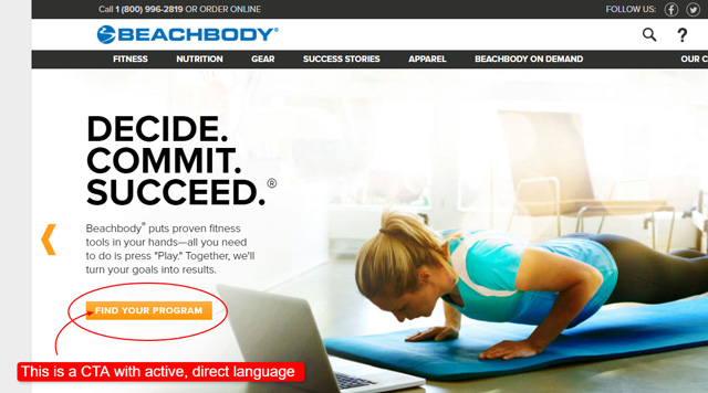
BeachBody offers nutrition plans on demand, at-home exercise programs and exercise gear and equipment. Their visitors are motivated to engage further with their website by clicking on the “find your program” call-to-action.
This CTA promises personalised experience with the use of “your”. “Find” is an active verb that motivates action.
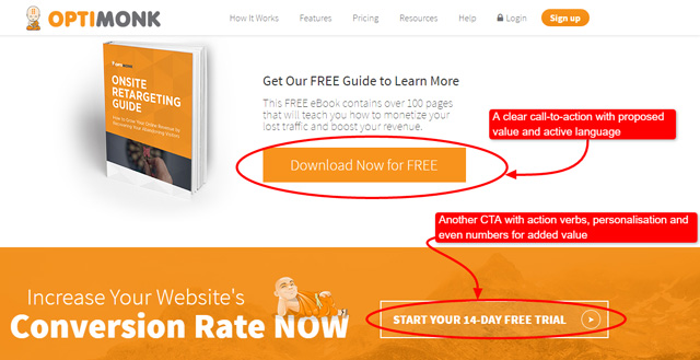
Optimonk offers a free ebook. They use active verbs such as: “download” and “start”. They also engage the readers by emphasising on the fact that their trial and download are free. Adding “free”, as well as using time expressions such as “14-day” and “now” motivates readers to take immediate actions.
AVOID using vague, passive words and expression such as “our products” – it doesn’t really invite people to do anything. The same goes with seemingly active verbs used vaguely, such as “download” – Download what? Where? Why?
There is no answer – therefore, no reason for the customer to follow up .
While the above Optimonk example uses the word “download”, it doesn’t leave it to stand there alone without a context. It is very obvious what will be downloaded and the call-to-action also gives the information that the download is free and that action needs to be take now.
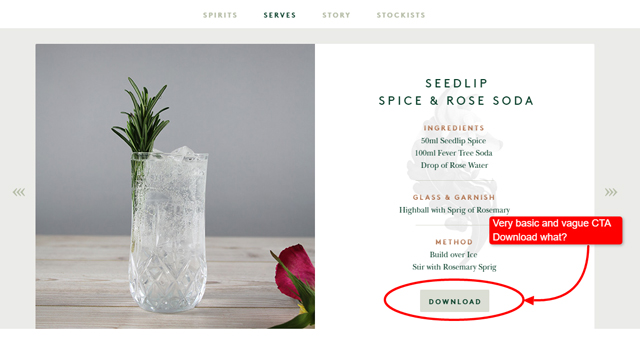
Here Is a Bad Example of Using the Same Word
Seedlip is advertised as a producer of alcohol-free spirits. It’s website has some really well-made CTAs, but then, there is this one. It gives the impression that a customer can download this cocktail! It’s just too vague. It could have been improved with “download recipe,” or something similar.
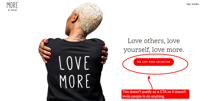
MORE by Bourn has several CTAs down this page and some of them are quite good. However, this is the home page and the most visible and obviously clickable button doesn’t contain actionable language and it doesn’t invite the customer to do anything.
Create the sense of urgency that encourages visitors to act now (e.g. get 15% off on all items while supplies last, or save $25 on all (name of brand) items ’til midnight). Use the expressions such as: last chance, limited supply, expires soon, limited time offer and the like.
Quantify the benefits, discounts, create an impact by adding numbers.
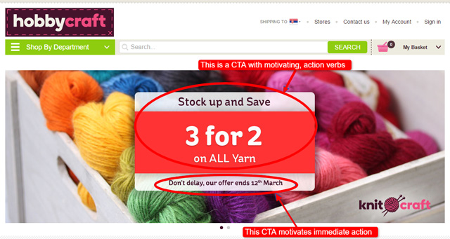
HobbyCraft has a sale that is time-limited. It has a great CTA button that invites people to stock up a nd save which proposes obvious value for the customers. The value is increased by the use of numbers. Lastly, the CTA reminds people that the offer is limited, emphasising on the importance of the immediate action.
You get the idea.
Believe it or not, expressions like these can really get visitors to click through.
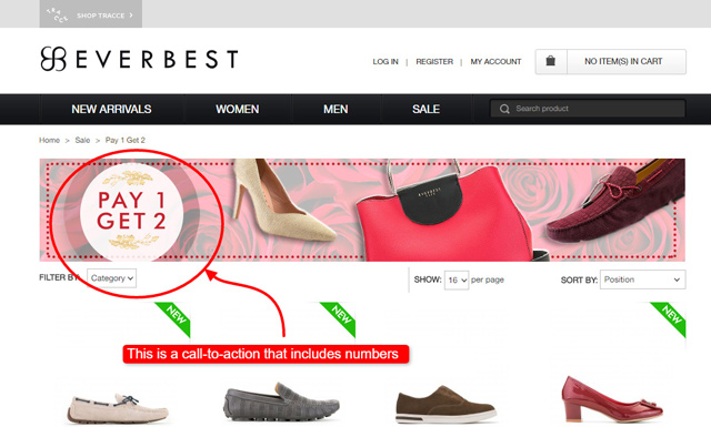
1. Everbest is a shoe seller that had a sale. They decided to include an enticing call to action that uses numbers and gives a straightforward benefit to their buyers – 2 for 1. It is a great example of using numbers for an efficient impact.
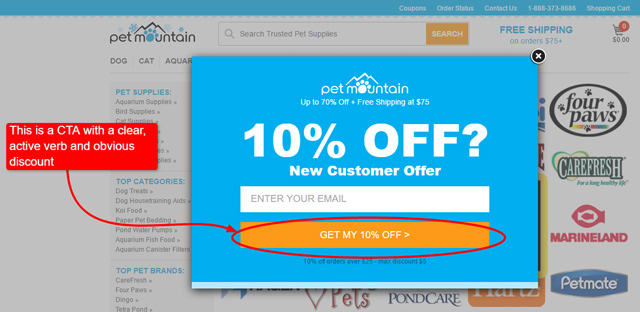
2. Pet Mountain is a pet supply store that has a pop-up window with a very clear and obvious discount call-to-action that invites people to get THEIR 10% off. This CTA offers discount, uses active verb ‘get’ and even personalises the discount by using ‘my’.
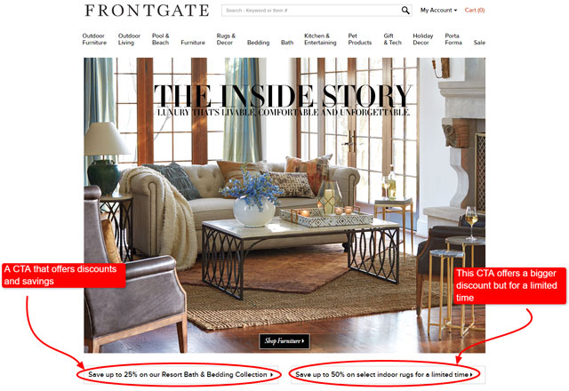
3. Frontgate sells furniture. There are several CTAs on their page, but the two of them are good examples of using active verbs and time sensitivity to entice people to take action. One CTA offers savings of 25% on furniture. The other one offers even 50%, but for a limited time only. That is where the fear of missing out (fomo) kicks in and people click.
Simple, Everyday Language
Use plain, understandable language to engage with the visitor. Avoid technical terms and jargon. Keep your CTAs simple, uncluttered, and straightforward.
Explore our latest collection
Is much better than using the technical jargon and the terms that your customers don’t really understand, such as:
Descale your steam generator!
Let’s say that you are selling the product that is used to remove the limescale from the steam irons. The product itself does it by dissolving the calcification from the steam generator in the iron. Now that you have this entire explanation, the CTA above makes more sense.
Moreover, avoid using language that sounds pushy and salesy! Use the words that provoke intense emotions (such as curiosity, greed, pride, or even panic) and enthusiasm instead.
Change your life with our product
Is not something that anybody will believe. It is too salesy and it promises something that no product can deliver or guarantee. A far better version is:
Improve your health today
Let’s take a look at how Oriflame does it. They have a multi-level program, as well as the online shop. Their aim is to convert visitors into buyers and some of them even into future Oriflame representatives.
The first several sentences paint a great picture about working with Oriflame: having fun, making money and looking great – everybody wants that! The CTA that follows invites people to find out more.
This example shows how you can inspire curiosity and then offer your CTA as a solution. All that by using simple words.
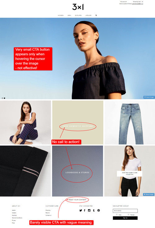
On the other hand, 3×1 Jeans has several weak CTAs on their home page. In terms of vague and unclear language, the biggest mistake is the call-to-action that asks the reader to “Reset Your Content”. It is not clear at all what that button does or even what those words mean.
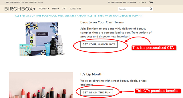
In addition, identify what your visitors want from you (help, advice, etc.) and tailor the phrasing of your CTAs accordingly. Always aim at a personalised, benefit-oriented CTA because it’s more relevant and it makes a visitor feel more in control.
For example, Birchbox is an eCommerce store that, in exchange for a monthly subscription, sends their clients boxes with skin care products. Notice how the words “your box” personalise the call-to-action:
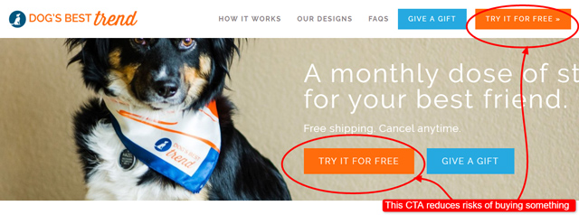
Include a no-obligation statement that reduces or removes the risk of buying something, for instance, a free trial instead of a purchase.
Dog’s Best Trend had an interesting concept. They offered monthly plans that their clients bought and in exchange they received surprise packages with stylish scarfs for their dogs.
Since the concept is a bit risky for the customer because they cannot be sure what they are getting for their money, this company made a call-to-action that has a no-obligation statement.
They offered free shipping and the option of canceling at any time. The CTA itself invites the users to use free trial.
Creating Effective Call-To-Action Design
To achieve eye-catching CTA design, besides the text, it’s also extremely important to consider the images and colours surrounding the CTA button. You’ll make your CTA more prominent and appealing if you:
- Contrast its colour to the background colour of the page, but match it to the colour of the product (in the relevant picture) or your logo (tend to use warm colours);
- Make it stand out by allowing it enough white space “to breathe”;
- Make it big, bold, and make its button look clickable (e.g. add shadows and borders);
- Surprise the visitors by using some unconventional shapes of the CTA button (e.g. oval or star-like).
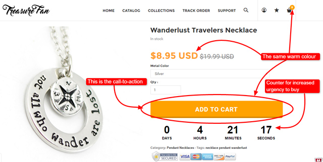
Treasure Fan has a call-to-action that works well in many ways. It uses the warm colour that is a part of the website’s colour palette. The call to action is clearly visible and has enough ‘white space’ around it. It has a shadow, so it looks like it is physically clickable.
It also has a counter that increases the urgency of the customer to take action.
On the other hand, Bitbots is a BAD example of a call-to-action button design.
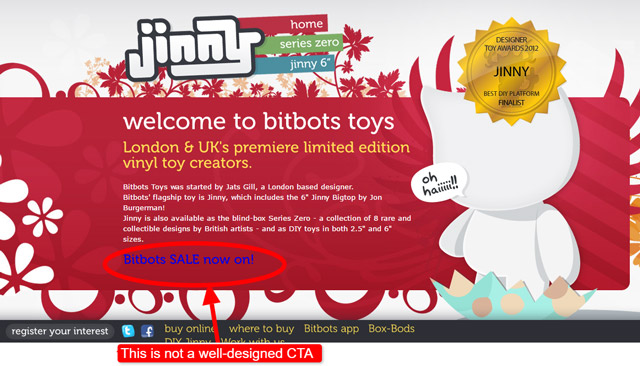
The CTA is in a completely wrong colour. It clashes with the background and it is not pleasant to look at. Moreover, it doesn’t have anything to do with the rest of the colour palette. There is no actual button there, either.
As for the wording of the CTA, it does provide the info about the sale, but it doesn’t invite the reader to take action.
Call-To-Action Placement
For an eCommerce store, a CTA is usually placed on product pages; at the end of product news, updates, blog posts, or articles; specific pages for promos such as discounts and sales.
Emazing lights product page features the call-to-action right below the name and the price of the product, inviting the readers to add it to the chart.

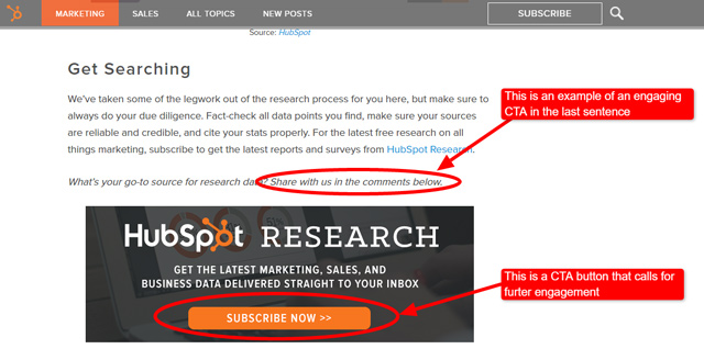
As a part of a blog post it’s usually the very last sentence where you ask readers to take action. It could be an invite to make a comment, share on the social media or subscribe to the blog. This is a good example from the HubSpot marketing blog.
Your CTA can also be in the top left corner or any other suitable place. The most effective placement actually depends on the context of the rest of the page.
In a nutshell, DON’T neglect the position of your CTA! Put it within your visitors’ “eye path”, so that they cannot possibly miss it.
Comparing and Contrasting Some Examples of CTA
Weak CTA
- Call Us [weak CTA, no value proposition]
- Read more here [weak action verb, will not lead to a strong further engagement with the website visitor]
- Toll free number 1300 666 777 [NO action word (verb) used, only contact number given, reader not prompted or asked to get in touch]
- Our products make your workplace safer and greener. [value proposition laid out but NO CTA]
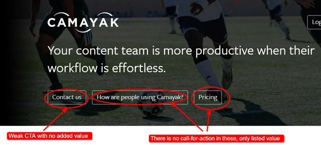
Unfortunately, Camayak website lists several of these weak calls-to-action.
Strong CTA
- Make your own workplace safer. Call Monarch at 1.800.543.6650 What are you waiting for? [clear value proposition, prompts immediate action]
- If a perfect beach body is what you want, then all you need to do is buy our workout DVDs today! [clear value proposition, strong action verb, urgent action to be taken]
- Mattress Firm will be at the WNY Home & Garden Expo on April 23-26. Do visit Booth #319 at the Event Center and Expo Building in Hamburg, New York to find out about Tempur-Pedic and iComfort adjustable mattress sets. Mark your diaries. [clear immediate action to be taken, value proposition is to find out about the Tempur-Pedic and iComfort adjustable mattress sets]
- Chat with one of our assistants and let them help you choose the best mattress for you. [entices immediate action and offers positive results from that action – choosing the best mattress]
To view more effective examples of CTA and find out why they work, you can follow this link WordStream: 11 Kick-Ass Call to Action Examples (And Why They Work).
In Summary
A retail advertisement or commercial without a call-to-action is considered incomplete and ineffective.
Understanding the importance of CTAs will help your messaging stand out and allow your visitors to know exactly how they should act. A product page or advertisement without a strong call to action will be less likely to lead to a sale or other conversion (for example signing up to a newsletter if that’s what you want them to do).
Every strategic call-to-action must:
- Tell people what exactly to do
- Encourage them to respond immediately
- Offer them certain benefits
- Give them a no-obligation statement that reduces the risk of buying
However, you should be aware of the fact that all the strategies mentioned above will NOT work for all CTAs in every business.
Research by Jacob Nielsen shows that an average user spends no more than 20 seconds on a website. With this in mind, it would be wise to focus directly on the benefits you’re offering to your visitors, which could help convert them into readers and future customers.
Therefore, make sure you always:
- Determine your CTA
- Put forward a clear value proposition
- Use actionable language
- Create enticing CTA design