
So far you’ve certainly realized that once you start your online career as an eCommerce copywriter within an online store, writing the content for the store’s web pages will be a part of your daily tasks. Nice!
Also, you’re aware that the following are the essential pages every serious online store website should have:
- An About page, which will make the store shine
- A Help center, which will help customers to help themselves when the staff isn’t immediately available
- An FAQ page with a neatly organized collection of all the relevant questions customers have asked or might ask in the future
- A Contact page with diverse and thorough contact details provided in a warm and welcoming way
- A Why buy from us page to persuade the customers that store is exactly the right choice for them
Along with Refund policy, Privacy policy, and Site terms of use, these make the basis for a decent eCommerce website. It means, ALL these pages are almost equally important for boosting an online store traffic and really selling the products.
The aim of this lesson is to help you learn to create an interesting, successful and easy to understand Why buy from us page. You still wonder why it’s necessary for an online store?
A good Why buy from us page should help clear any lingering doubts in a customer’s mind that buying from your online store is difficult, inconvenient and not worth their time.
In order to achieve that, an excellent copywriter (such as the one you’re going to become) first needs to understand the customers’ motivations i.e. whether they’re buying for practical reasons, entertainment, vanity, or perhaps some other reasons.
When you know their major concerns and why they’re buying, you can easily address these successfully in a Why buy from us page.
So, let’s learn about the characteristics of a top-quality Why buy from us page by comparing and contrasting some of the already existing pages of online stores. But, before that, we’re just going to briefly highlight the importance and benefits of such a page.
So, here we go!
The Importance and Benefits of a Good Why Buy From Us Page
A Why buy from us page is a store’s sometimes first and sometimes final pitch to their prospective customers. If you did your work right, other pages on your employer store’s website have already answered the questions of what you can provide the customers and why the customers can trust your team.
Then, the Why buy from us page is where you drive home the point that buying from you will be an experience the customers will NOT regret.
That page is another chance for eCommerce store owners to establish themselves as trustworthy but – more importantly – this is where they emphasize how convenient and pleasant the experience of shopping with them can be for the customers.
Remember that your Why buy from us page should present the viewer with a list of reasons why shopping with you is to their benefit. More about this list a bit later.
Take care not to be boring by using positive and upbeat language and include interesting images to keep their attention.
Above all, make sure the layout of your page is attractive, clear and easy to read.
Now, it’s time to illustrate these points with some good and bad examples so that you as a copywriter can quickly grasp how to write a Why buy from us page that sells more.
What Should an Exceptional Why Buy From Us Page Look Like?
Anything but an exceptional Why buy from us page is very likely to miss its point. Fine, you got it. But you still don’t know what such an extraordinary page is supposed to look like, right?
You’re about to find out the answer to the question above. Just take a close look at all the content and examples to follow.
Carefully observe and absorb the inestimable information presented in this lesson because you’ll probably be proud of your knowledge and success once you get the chance to demonstrate your skills to your future employer. Shall we talk more about how immensely rewarding it could be? Doubt it.
So, let’s start. First, we’re going to show you some disastrous examples, and move gradually to those better ones. Ready?
Example #1
Shoptronics is trying to tell us how trustworthy they are and how reliable their deliveries are using graphics, which is OK but…
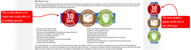
Many stores will actually offer a money-back guarantee, so it’s NOT a compelling reason to buy, just something that can make a customer feel a bit better.
Lightning fast shipping is also OK but it actually sometimes (if not often) doesn’t happen in practice, so be careful with it…
Then, full manufacturer direct warranty is also nice to offer, but wouldn’t you, as a customer, be thinking what exactly that is in this case – a week or two years, perhaps?
Furthermore, a customer may think:
‘Alright, I feel a bit better about this company, but they’re nothing special. They offer what a vast majority of other stores do, so it’s not a big deal. There’s NO real difference.’
Is that the effect you want to achieve? Certainly NOT.
The truth is that you should tell the customers what’s totally different about your store that will actually make people buy from you. That’s the trick with this page!
This outdated example does NOT give the reader solid reasons for buying which are different from competitors, thus missing the key points of a good Why buy from us page.
Example #2
Another really bad example of a Why buy from us page is Pillow Talk.
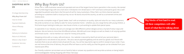
As it can be noticed at first glance, it’s really difficult to read because of the big blocks of text. The text simply runs on and on with nothing for the eye to grab onto. It’s also bad, but let’s see what they could have done to improve it.
Just a few changes such as these would be enough for a completely different effect:
- Adding subheadings to foster skim-reading
- Adding bullet lists
- Highlighting the important phrases using bold, italic, or CAPITALS
- Adding icons or pictures of e.g. a friendly person, or anything else suitable to reinforce whatever’s being said
Remember all those tips and tricks about formatting content for the web we were talking about in the Blog post basics series of lessons within the Introduction to eCommerce blogging?
However, the only thing a reader can see here is 4 to 5 blocks of text talking about something most of their competitors will offer, as well. There’s nothing that helps them truly stand out from the rest of the crowd – thus NO real reason to buy from them precisely.
Example #3
Optics Central is another not-so-shiny example of a Why buy from us page.
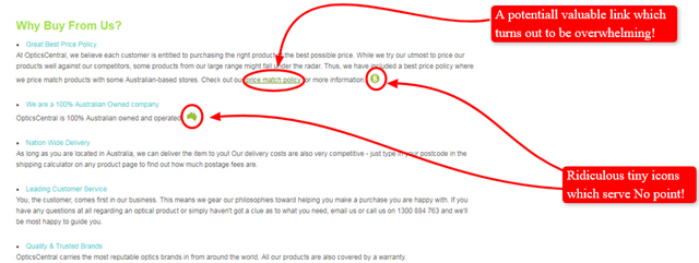
You may wonder why since it’s got colored subheadings which make it easy for skim-reading. There’s also the link to their price match policy, which is a great reason to buy from that company.
So, what’s wrong, then? Here’s what.
You’ve probably noticed the ridiculous tiny icons which serve absolutely NO point.
How could it be different? Instead of a tiny icon it would be better to show something colorful and with a flag or happy people, for instance. Remember – add more visual information but make sure it’s highly relevant and valuable!
In addition, when you check out the mentioned link to their price match policy, you’ll notice there’s too much to read about. Those caveats may be great. What’s more, an average customer might check them out, BUT they probably would NOT bother with reading all that in detail.
Thus – the point missed here! You see?
We bet you’re a bit fed up with all those bad examples and looking forward to seeing what it’s all supposed to be like, right? A little bit more patience, please. Here it comes!
Examples #4 and #5
Now let’s compare Cuffed with Gazebos Australia to see how a great Why buy from us page can mean the difference between someone making a purchase and someone NOT making a purchase.
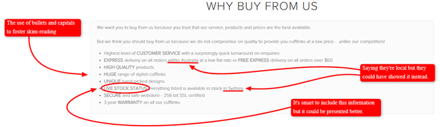
The Cuffed Why buy from us page is slightly better than our previous three examples because it at least uses a bullet list and capitals to allow people to skim-read quickly.
Then, live stock status is also a good thing to include on your Why buy from us list of reasons.
You wonder why?
Well, sometimes when you order online and they don’t have the product you ordered, it means that you’ll have to wait for e.g. three weeks or more, which is annoying. That’s why this information may come in handy.
Moreover, it’s even better to have an animation that shows a livestock status diagram, which doesn’t actually have to be real, just to present visual information. There’s something like a live sales map on Gazebos’ page, which shows the sales currently happening.
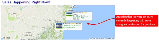
People are really motivated when they see somebody else is already buying from an online store and it also gives them a sense of security about why they should buy.
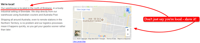
Another thing included in both example pages is saying the customers they’re local. But how?
A lot of other stores claim to be local, so what’s a big deal about it? Why is Gazebos store different?
Well, is it NOT enough only to say ‘We are local’ like you can see in the Cuffed example, of course.
SHOW it on a map and give that visual connection to the viewers just like Gazebos Australia did. That’s why they differ from the rest! That’s why they’re much better! Yet, what they did is no nuclear physics, right?
Now, let’s see what else you can learn from this Gazebos page.
Another thing they’ve done well is that they’ve reiterated what the product they sell is (with a photo of a gazebo) and that they know their products well. They’ve also pointed out that they genuinely care about their products and customers, as well as that they’ll be here for them in the future.
We’ve already mentioned the use of visuals and graphics to show they’re local and reliable. More about the specific graphics a bit later.
In addition, they make great use of little things like that photo of a girl on a computer behind the scenes. Again, you see nothing special here?
Here’s the secret.
It doesn’t even have to be a real photo of you or your team members, just anyone looking like that might be one of you. However, the message the photo conveys is strong:
‘We’ll talk to you behind the scenes. We’ll pay attention to you. We’ll be there for you.’
Simple, yet so powerful, don’t you agree?
Furthermore, it’s always a brilliant idea to include a photo of your team because by looking at it a customer will probably think:
‘Look at how many people work there! This is not just a one-man band in the back of a garage, but a really serious team. Then, how could I go wrong buying from these people?! They all look nice and professional.’
That is the reassurance you want to provide!
Then, the use of those icons and subheadings at the bottom of the page is quite a lively and catchy way of presenting all that information.
As you can see, their page is pretty interesting and visually appealing because there are lots of things going on, so it’s far superior to any of the previously mentioned examples. It’s because you can see that these people have really put in some effort in creating their page, unlike the others we’ve analysed so far.
All in all, here’s what you MUST remember based on everything previously said.
If you create really fantastic, persuasive, and compelling reasons to buy, than people are more likely to do that and then your conversion rate goes up. It means your store makes more money and that’s why a great Why buy from us page is proven to be particularly significant and useful for every eCommerce website.
Got it? Great!
Now, let’s dive into more details, shall we? We’re not even close to exploring all the valuable examples.
Decide on a Visually Interesting Layout
Every eCommerce store needs a distinctive look and feel that should carry on throughout the store – the Why buy from us page should be NO exception.
Firstly, it’s highly recommendable to make it a completely separate page instead of scattering a few reasons with icons showing why customers should buy from your store all around the website or even incorporating few of them into any other page.
Secondly, this page has to be interesting and catchy! You can achieve that by using various attractive, relevant, and valuable icons, pictures, graphics, or any other visuals that reinforce the statements you make on the page.
Thirdly, make sure the colors and fonts you decide to use are clear and readable. You want people to be able to get answers to questions from your Why buy from us page so you need the information on the page to be crystal clear.
Moreover, don’t underestimate the power of subheadings, bold text, or bullet lists. They’re among your best friends when it comes to readability of any web content, remember?
Also, if you already have a basic template or theme for the store, you should use it in your Why buy from us page.
Last but not least, always make sure that all links, graphics and videos you use work and load quickly. You want people to find out what they need from your Why buy from us page, not leave in frustration, right?
Now, when you know the main characteristics of an excellent layout, let’s see some examples.
Example #1
Remember how Gazebos Australia use graphics to point out a piece of information? Here’s a great one.
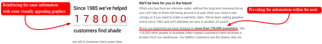
Readers might miss the shown information if it was just written in the text, but creating some custom graphics makes the info really stand out. How convenient that is!
Therefore, support all your reasons with visuals! Don’t just make statements but use visuals to demonstrate the truth behind those statements.
Example #2
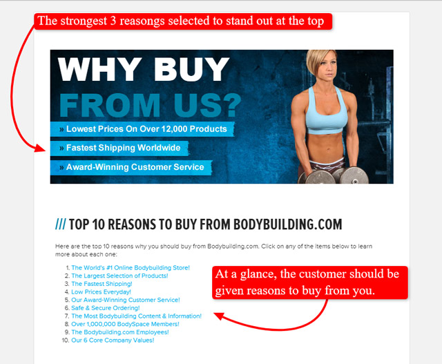
Here’s another outstanding example of clearly presented information. By giving screenshots of their own website pages Bodybuilding has shown the readers they’ve got really comprehensive information on their website.
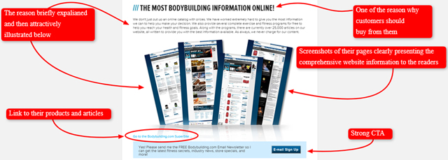
Not only is their layout fantastic, but they don’t miss the opportunity to link to their articles and products, as well as to incorporate a strong call to action (CTA) and invite the visitors to subscribe to their newsletter.
It is an incredibly smart strategy to ensure conversion by using the reasons why people should buy listed on this page to link through to the products, don’t you think?
For instance, one way of doing so could be to offer money-back guarantee but perhaps to link to a current special on a particular product from it. That’s how you can slightly push people to buy your products because it’s your primary goal, isn’t it?
Also, as you can see, there’s only a short paragraph here explaining one of the reasons why people should choose them over their competitors. Yet, the perfect layout and the use of visuals make this presentation so powerful.
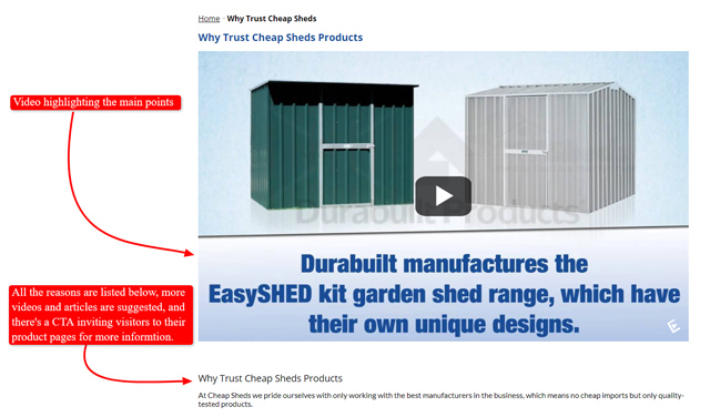
Example #3
Another fabulous example from Cheap Sheds demonstrates an excellent use of videos on all their pages, and you’ve already learnt how much Google loves this type of content.
Thus, besides listing and explaining the reasons why customers should trust their products, they’ve included a short video summarizing the main points. Here’s what it looks like.
Example #4
BeeFriendly also makes great use of videos. Here’s one summarizing the reasons why customers should buy from them presented by a friendly team member.
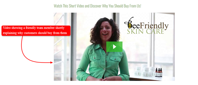
You see? Videos come really handy for presenting information persuasively and avoiding overwhelming your customers.
However, the problem may occur if the video is the main content of the page and the only medium by which the reasons to buy are listed. It’s still probably better to have a list and reasons in the text in addition to the video, just in case the viewer has no time to watch the video or if their computer has difficulty playing videos.
Ok. Now when you’ve figured out what a fantastic layout should look like and how visuals can help you achieve it, it’s time to deal with the reasons you’re going to present on that page in order to persuade the customers to search NO further since you’re exactly what they’ve been looking for.
Here’s what to do.
Make a List of Reasons Why They Should Buy From You
Enumerate in a few words or a sentence the reasons why buying from a specific (i.e. your employer’s) online store is an experience they will NOT regret. With a glance at your list, the customer should be able to tell why the shopping experience with you is superior to others.
Again, take a look at how perfectly the Bodybuilding store has done it. Isn’t there a lot you can learn only from their page? Grab those precious gems, then!
One of the biggest draws of the online shopping experience is the convenience factor of being able to get something you need without leaving your home. On the other hand, one of the biggest misgivings people have about buying online is that they might NOT get what they need.
The Why buy from us page is where you convince them that you will be able to deliver what they need quickly and conveniently. You must make them trust you.
We’re going to present an extensive list of reasons that other online stores use, so that it’s easier for you to compile your own list once you need it. Among the ideas we offered below, you can just select the most appropriate ones to use as they are if that suits you, or adjust them to the specific features of the store you’ll be writing for.
If you provide the following, it is where you talk about your customers’ satisfaction as your top priority:
- Quality control
- Reliable, high-quality, extra-durable products, easy to use/assemble/maintain etc.
- Attractive, innovative, exclusive, authentic, unique, or stylish design
- Shipping guarantees such as expedited or free worldwide shipping
- Shipping tracking
- Lifetime warranty
- Hassle-free return/exchange/cancelling orders
- Cost-effective maintenance of the purchased products or even maintenance-free products, or a national servicing network
- Monitoring live stock status
- Insights into the sales currently happening on the store’s website
- Insights into what’s happening ‘behind the scenes’ online or offline in the store’s venue (e.g. showing photos of the team in action, photos of working space, photos/videos showing how products are made/assembled, and the like)
- Extra convenient operating hours
- Early access to sales/special premium customer status/offers if they e.g. subscribe to your newsletter
- Easy return and exchange programs
- Money back guarantees
- Free e.g. 14-day testing of some/all products, free samples, or special-price gift cards
- Best value for money, lowest pricing, or price match guarantee
- Any special programs or promos for online shoppers, such as:
- Discounts for deliveries to certain areas or at certain times
- Volume order specials
- Tax exemptions, and the like
- Various payment options or partners
- Secure ordering and payment/transaction
- Qualified, licenced or government approved company (if relevant)
- Major supplier for a region/country/area
- How you’re locally based trusted business with an impeccable reputation
- A wide selection of affordable customised or hand-crafted products
- An extensive selection of exclusive and genuine international/local brands
- One-stop shopping destination offering effortless shopping
- Offering additional services or providing e.g. gift ideas that match your products/business
- Contact methods such as help lines or a live chat – any way they can get quick answers to pressing questions
- Friendly, knowledgeable, committed, and professional anytime customer support,
Industry or service awards displayed - Outstanding core company values, principles, and mission such as:
- Treating both employees and customers with respect and fairness
- Goodness on all levels
- Ensuring a safe and secure neighbourhood
- Dedicated to serving basic needs of the local community
- Combating childhood hunger
- Improving children’s health
- Encouraging women’s economic empowerment
- Being environmentally friendly
- Enhancing the sustainability of global supply chains
- Saving endangered animals or providing shelter to abandoned ones
- Being a leader in employment opportunity
- Fixing your mistakes
- Treating your customers like family
- Focused on producing exceptional products and continuous improvements to their quality
- Appreciating loyal customers
- Being directly engaged with all the customers
- Helping creative entrepreneurs start, manage, and scale their business
- Experts or satisfied customers’ testimonials (photos/videos) showing you’ve exceeded their expectations
- Companies or organisations you’ve partnered with
- Any other program or policy to assure them that they will receive their order
However, ALWAYS REMEMBER that a truly good copywriter writing for an online store would be careful NOT to put in a list of 100 reasons because it becomes overwhelming. You can’t just stuff everything into a hamburger and expect it to taste delicious, right? Sometimes just a few ingredients are what makes a meal truly delicious. Got it?
Your aim is to hit those special ones that will spice up your page.
Therefore, it’s advisable to select between 4 and 6 reasons because that’s the optimal length of a list.
You wonder why?
Anything more than 7 – people don’t read it, anything less than 4 – there’s no real point having a list when you can have sections instead.
If there really are more than 6 equally strong, unique, and convincing reasons you have to use on the page, please, do your best to keep your list NO longer than 8 to 10 of them.
Should we repeat why it’s not wise to exceed this number? You’ll produce an adverse effect and that’s NOT what you’re paid for, right?
However, it is not enough just to list your top reasons why buyers should trust you. You must also back them all up or explain them briefly.
In the next subsection, you’ll learn more about how this should be done. Ready?
Explain and Back Up Your Reason to Buy List
Some people will need more than a list to be convinced. While you should start out with short yet descriptive reasons to buy from you in your list, you should be able to elaborate or defend these reasons further down your page.
Above all, try and make sure that you deliver the information in a way that is friendly and engaging. Your page might start with a list, but there’s NO reason it should stay a plain list. Use videos, graphics, images and photos to keep viewers’ attention, remember?
A dull, boring, badly written list of reasons is NOT what your page should be about!
Here are several valuable examples which focus on elements that used to keep the pages from being dull. You might want to incorporate similar elements into your own page.
Example #1
Vat19’s Why buy from us page gives a list of reasons to buy from them and elaborates on them using fun and friendly language, graphics and even several great videos.
Follow the link given at the beginning of this example to analyze it and learn from it!
Here are just a couple of highlights: graphics and a video supporting the textual explanations.
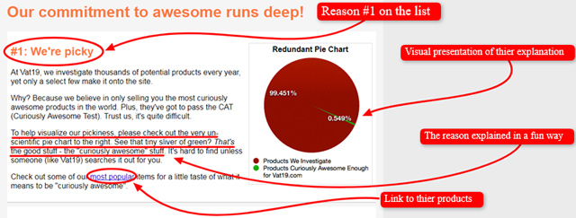
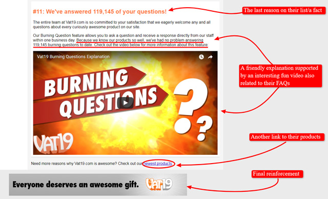
This is an awesome page you can learn a lot from!
Example #2
Similarly, if you look at the screenshot of the old website for The Massage Outlet, you will see it uses video as its main medium to transmit information but it also uses graphics and text to bring across some important points. Here’s what it looks like.
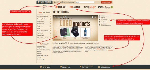
The most common reasons the other stores offer are scattered around the page and listed on the side. However, the most valuable reasons specific to their company are presented in a professional friendly video, one of the unique reasons being that they return a portion of every sale to the buyer’s school.
Now you see what we mean by unique and original?
What’s more, they also link to their About and Contact page for further information, as well as offer a big save with an instant coupon, which is quite compelling.
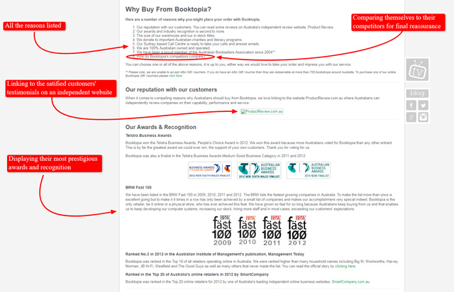
Example #3
Booktopia establishes its reputation by including graphics of the awards they’ve earned as well as the external independent link to their customers’ reviews.
More interestingly, as an explanation for the last reason on their list, they elegantly and professionally compare themselves to their most prominent competitors answering the question why choosing them over the competition. Isn’t that unique and brave?
Example #4
Now, take a look at how Bodybuilding.com emphasizes its promise of fast and efficient delivery by including a map with its shipping facilities and locations.
Not only that! They also provide the link to the directions to those locations, as well as the customers’ testimonials.
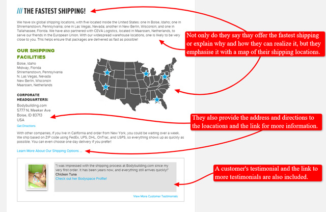
This small portion of page is jam-packet with persuasive information but it’s far from overwhelming! Observe it and soak up that knowledge!
Moreover, feel free to follow the links to all our examples and dig deeper into the secrets of the successful Why buy from us pages.
In Summary
In a nutshell, when creating this page, always bear in mind that it’s all about deep understanding of your customers’ motivations and successfully addressing them to make people trust you.
Therefore, don’t miss this great opportunity to boost the sales by providing people with solid reasons for buying from your store and pointing out what makes it stand out from the competitors.
This page deserves to be a separate one! All the effort will pay off once you see how it ensures conversions, which will happen when you wisely push the customers back to your product pages by linking through to them from all those reasons you present. Remember the successful examples above?
Along the way, make sure you pay attention to the following details:
- Choose a visually appealing layout for your page. If you already have an interesting theme for your store, use it. Videos, graphics, images, or any other high-quality relevant visuals will make wonders!
- Choose fonts and colors that keep your page readable
- List the reasons why people should buy from your page (ideally between 4 and 6).
- Explain the reasons why people should buy from your page. It’s not enough to just say something and leave it like that – you must back it up. Keep your explanations interesting yet informative
- Make sure that all and any links or special features of your page work properly
Frequently Asked Questions
1. Which of the following statements are true?
a. It’s always better to have the reasons why customers should buy from you scattered all around your website because a visitor could get the info quickly without having to search further, saving time.
b. It’s highly recommendable for every serious online store to create a separate, visually appealing and interesting Why buy from us page, which will provide the customers with solid persuasive reasons why they should trust that particular store.
2. How many reasons should be listed on a good Why buy from us page not to overwhelm the reader?
a. At least 50.
b. Never exceed 4.
c. Ideally between 4 and 6, but can be a bit more if they are all equally unique and compelling. Anyway, it’s not advisable to list more than 10.
d. More than 100.
3. recordergear.com has reasons to buy from them scattered all around their website.
a. True
b. False
4. torpedo7.co.nz has an excellent example of a Why buy from us page.
a. True
b. False