
The aim of this guide is to help you create a store style guide to ensure that your client understands the different elements of your design in order to help them use the design for proper branding.
In order for branding to be effective, it must be easily recognizable; the viewer should immediately associate and identify the branding materials with the company that they represent.
A big key to branding materials being recognizable is for them to be visually consistent. A style guide will help maintain visual consistency by showing and telling your client how to use the different design elements.
Keep in mind that your client has not had your training and as such does not have as unerring an eye for what looks good and what doesn’t. Providing them with a style guide will keep them from experimenting too much with your design and preserve both your designs integrity and your reputation as a designer.
There are four major design elements that should be included in your style guide: logo, color, typography or fonts, and images.
You need to know this guide because …
- helps create consistency across all of your business materials
- serves as a single communication material which defines your store’s identity
- is shareable within your team and/or outsourced staff – allowing more control over your brand
- serves as a crucial document for new ventures, projects, store updates, and such
Step 1: Show Your Client What The Logo Looks Like
The logo is the most recognizable part of a brand identity; it is also the one that will be subject to the most possible use variations.
Make sure your style guide includes different images of the different variations of your logo design. It is important that your store’s identity is clear and already in place because this will help you establish a style guide that’s unique and in line with your brand.
Step 2: List Down The Different Situations In Which Each Logo Can Be Used
Not only should your style guide include all possible variations on the logo look, it should include the different situations in which each logo look should be used.
Think of your brand as a person. How do you convey this personality through your store/brand? Identify the traits that will appeal to customers.
Step 3: Explain The Different Variations On The Logo Look
Depending on how your client will use the logo, there will be variations in the design. Make sure to explain these variations. Include acceptable colour variations, minimum and maximum sizes, layout, placement and even allowable white spaces.
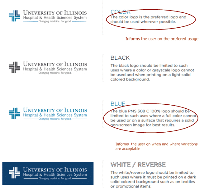
The style guide of the University of Illinois gives the user a visual representation of different variations of the logo, including acceptable colors the logo can come in. The guide also shows when and where they should be used.
This example from Vidyo provides visual examples of the acceptable layouts and sizes in which the logo can be used.
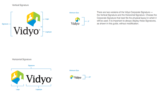
TIP: Minimum and maximum size ranges are important to keep the design from becoming illegible.
This example from Walmart’s style guide shows how they specify the amount of clear space around their signature and logo.

TIP: Don’t use measurements such as inches or centimetres to measure acceptable white space, rather use a portion of the logo to set the clearance.
Step 4: List Down And Show All Colors Used In The Design
The right use of color is important in maintaining brand integrity. Just think about how different the McDonalds logo would be if it wasn’t for the “golden arches” or how confusing it might get if Coke used blue or Pepsi stopped using blue.
Your style guide should include a defined color palette. Have a visual representation of every color – in every shade – that can be used in the design.
Make sure to clearly define each color by name and color value. You should also provide primary, secondary and alternative colors for every use; values for print (CMYK) or digital projects (RGB, HEX); and Pantone colors.
TIP: Use color swatches of your preferred primary and secondary colors to ensure that whoever will use it will be able to determine which colors are used for specific elements (such as buttons, banners, font color, etc.) on your website and/or other content types.
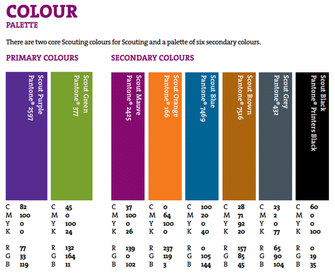
The following examples from the style guide of Scouts contain color swatches, names and values.
Step 5: List Down When The Different Colors Should Be Used
Make sure to explain when and where each shade of color in your color palette should be used. Tell your client which shade should be used for backgrounds, or texts or other design elements. Include situations in which a certain shade should be used.
Step 6: List Down And Show All Fonts That You Used In The Design
You need to specify what fonts you have used in all aspects of your design. Include guidelines for additional styling, size and use of color.
Start with fonts for headlines, sub-headlines, product descriptions, captions, and others. Update your documentation as you progress and share it with your client.
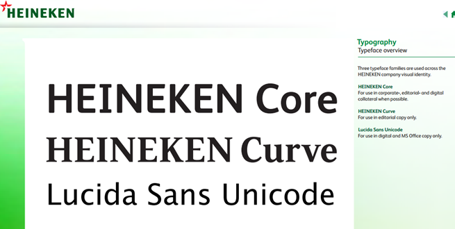
This example from Heineken’s style guide contains the basic information on acceptable fonts. It presents the three primary types of fonts they use and a bit of instruction on when to use them.
Step 7: Explain Which Fonts Should Be Used In Specific Situations
Make sure to include guidelines for when each font should be used and how it should be used. Specifying size and colour is especially important as it will ensure that the text will be easily visible and readable.
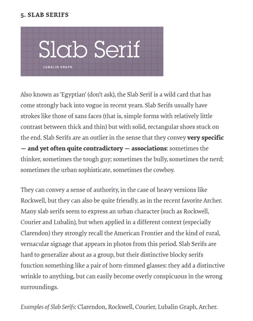
This example from the style guide of smashingmagazine specifically shows the different meaning of Slab Serif and when to use it. Also, it shows examples of the fonts in acceptable colors.
Step 8: Provide Image Guidelines
You should provide guideline on how images should be gathered, edited and used. Images used should help establish a particular tone which should reflect the entire brand.
TIP: The best way to explain is to show them examples of acceptable and unacceptable images.
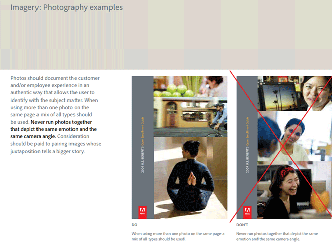
Take this example from Adobe. The style guide emphasizes the use of images of people to allow people to better emphasize with the subject material.
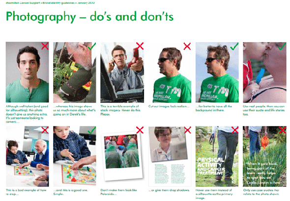
The MacMillan style guide also present several examples of the sort if images that should and should not be used. It also dwells on how they should be presented, including tips on cropping and editing.
Step 9: Define Your Brand’s Tone and Voice
Your product will help you identify your brand’s tone and voice. Most online stores use a casual, friendly tone and voice that appeals to customers because they are more personable.

You can start by asking these questions:
- Should you be friendly, quirky, or funny?
- Or should you be serious, strict, or straightforward?
Essentially, your tone and voice should be consistent. They should resonate within your store’s content, marketing, and communication materials.
Here’s a guide from Mail Chimp which is perfect example of documented tone and voice for different content types.
Step 10: Create Templates For Specific Content Types
With a style guide on-hand, you will be able to create a template for each and every page of your e-store as well as online/offline marketing materials. It doesn’t have to be elaborate and complex, but concise and easy to use for any of the staff.
Once the templates are in place, it will be a lot easier for you and your staff to stay consistent with any e-store content creation and update.
Example Of Simple Style Guides For Inspiration
Please note that these three examples are here to inspire you to create your own style guide. They are actually part of either a more comprehensive design manual or several-page-long style guide.
The idea is to take a look at how each style guide is organized according to elements such as logo, colors, typography/font, and other graphic elements, so you’ll be able to create your own style guide that is neat and easy to understand.
The best part of creating your own store’s style guide is having your staff help you in the process. So, if you have a graphics guy on-board, you can ask him to help out with the color palette and logo, for example.
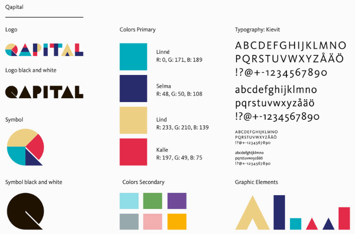
Example 1: Qapital
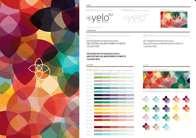
Example 2: Yelo Spa
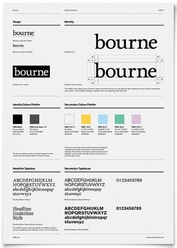
Example 3: bourne
Sample Template Of A Simple Style Guide
You can create your own simple style guide like the one we did above. You can update the format and the placing of elements according to your preferences.
This is just to give you an idea of what your store’s style guide should include based on the steps we’ve listed earlier. In creating a template for each content type, you may refer to this simple template and update the necessary elements that each one calls for.
Learn From Others
A style guide doesn’t have to be a weighty tome. A simple one page document covering the four basic elements can suffice.
This article has an example of a simple one page template that you can download and use for your style guide.
For inspiration, however, you might want to take a look at some of the style guides listed at these links:
- Brand Identity Style Guides
- 19 Minimalist Style Guides
- Why Does My Small Business Need A Style Guide
- Great Examples of Design Style Guides
- 20 Inspiring Branding Guides
You might also want to check out this youTube link for additional tips on how to make your style guide
Final Checklist
- Show them all the different looks that the logo can have.
- Explain when the different logo looks should be used.
- Provide a color palette.
- Explain when each shade in the color palette should be used.
- Show them all the different fonts that can be used.
- Specify when the different font variations should be used.
- Provide them with image guidelines.
Photo by Rawpixel / CC BY