
I know a little bit about camping supply stores having run campingcentral.com.au for several years. During my time I moved their monthly sales from $4,000 to above $30,000. Not a bad effort with limited budget and time! And in that time customers were always after a bargain and quick delivery.
These were always their top concerns. I’ve picked out 4 other camping equipment stores that have always ranked quite well in the search engines.
Perhaps we can discover why it is that they do so well! Let me know if you have any thoughts too.
1: Anaconda
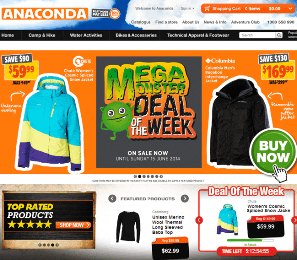
Particularly Like:
Bold Moving Feature Image
The first thing to catch your eye when you visit Anaconda are the full colour photos, and they’re moving. This instantly makes me think that the store is active and ‘alive’.
Aspirational Product Images
You’ll notice that Anaconda don’t have a catalogue of their products displayed right upfront. Instead they use product placement within aspirational images to get the ‘desire’ aspect across.
Obviously they have a fairly significant photographic budget to be able to create these aspirational montages. If you don’t have the same budget you can always create some kind of Photoshop montage as we did for GazebosAustralia.com.au. Cost is considerably less.
Video On About Page
Again, you might not think you have the budget to create a video but it can be easier than you think. Have a close look at the video on Anaconda’s about page. It is made of short film pieces, photographs, graphics, soundtrack and animation.
At the very least anyone, with any budget, can create a video of photographs, graphics, soundtrack and animation. It would cost less than $200 if you outsourced via oDesk, and the impact is huge.
I’d Change Or Optimise:
Readability
This is a small point (get the pun?) but the font is too small to read easily. The designer has not only chosen a small font size but they’ve also kept the leading (space between lines) quite narrow. This makes it difficult to read larger paragraphs of text.
And if your customers find it hard to read your text they won’t bother, and your message will be subsequently lost. Anaconda could fix this easily by running a
Google Website Optimiser test to find the optimum size. The aim would be to reduce the bounce rate (the number of people who come into the site and then leave immediately).
Test Buy Button Colours
In the past we’ve been able to significantly increase conversion rates by simply testing the colour of buttons. There’s no telling which button will work best but if a reasonably simple exercise can give you a 1 to 4% lift in conversions then it’s a good test to run.
For example, I would change the Anaconda price from being white on a black background to being the same colour as the button, and then see how that affects sales.
My bet is that aligning the price area (not the RRP area) with the actual Buy button will increase sales.
Multiple Product Images
A huge ‘gap’ for consumers buying online and in-store is their ability to really wrap their minds around what the product looks like. Anaconda offer a single image for each product and no more from what I can see.
I would choose 4 of the top-selling products and add multiple images and then see how that affected their conversion rates.
Running the test for a month would allow you to average out the increase/decrease in sales with a single change being that multiple images were added.
2: Ray Outdoors
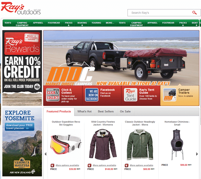
I Particularly Like:
Discount Offering
It’s a great idea to offer an ‘instant’ discount via some kind of VIP membership card. As a consumer, I get the feeling that they’re keen on giving me a really good price.
But my next thought is wondering whether they’ve built that discount into the shipping costs. It takes me a few minutes to work out where they’ve put their delivery costs, and then get it calculated.
And oddly the delivery cost is cheaper for the express, and not a round number. Quite confusing! I’m getting a bit negative here but the fundamental concept of having a VIP offering has worked very well for Babu.co.nz too (15% off) and should be something every online store offers.
I think 6.5% is a bit of a weird number. Perhaps they could be a bit more impressive?
In Business Since
It’s a small thing but just under their logo, they tell us that they’ve been in business since 1958. Conceptually that’s a massive advantage is a highly price competitive marketplace.
I don’t really care how long they’ve been in business as long as it’s longer than last week! If you’ve been running your business for any amount of time, then add it to your header area.
It helps consumers feel more comfortable with their buying decision. Don’t believe me? Run an A/B split test with a badge that says “in business since …” to your header and see the effect on your sales numbers.
Image Rollovers On Category Pages
Check out a category page and move your mouse over the top of an image. A magnified view will instantly pop up. Not all shopping cart software has this feature, but it looks fantastic. Their Brisbane-based developers have combined the image with a few notable points about the product.
It’s a great way to give consumers quick help in selecting the right product. BigCommerce should add this feature.
Footer Area Is Useful And Attractive
Using the footer area to add site links is really helpful for consumers wanting to quickly find delivery or contact information. Anaconda had a dark, heavy and virtually unreadable footer section. These guys have not only made the links very easy to read but have added some attractive photos to boot.
I’d Change Or Optimize:
Cluttered Home Page
Eeeek! The home page is brimming with stuff and colors and fonts and lines and pictures and … stuff everywhere. It makes the home page look a little less ‘branded’ and more ‘discount’. This is just my personal opinion – feel free to disagree!
Delivery Options Are Difficult
Working out the delivery costs to my area was a little confusing. I had to wait for the page to load a few too many times. My whole screen went dark, which could confuse some less tech-savvy consumers.
And the duplication of the delivery options buttons was very confusing. I didn’t know which one to press. On the bright side, I found the icons easy on the eye and useful.
Delivery Information Upfront
Although there is a link to delivery information in a banner area I was looking for it in the main navigation and also in the footer.
As it’s factual information I wasn’t expecting to see it mixed up in what looked like promotional information.
And then when I did get to the Delivery information it was part of a longer, legal-looking, unfriendly bank of usage terms and conditions.
No mentioned of actual costs, and lacking friendly language relating to when I might expect delivery and by whom.
Ditch Happy Campers! icon
I’d ditch that “Happy Campers!” icon in the top header area and replace with a Customer Service Guarantee, or a Warranty logo or just about anything else. Run a conversion test to find out which badge works best on sales and bounce rates.
I would run a whole raft of different badges and messages to find one that worked well. The header is a premium placement area and should be used well.
3. Roman/Companion Brands
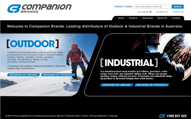
I Particularly Like:
Brand Associations
It’s a great idea if you don’t have a super well-known brand yourself, to associate your store with other well-known brands. Roman have listed the brands they distribute on their home page thus giving themselves credibility by association.
Facebook Presence
Even though it’s small they have at least started a Facebook fan page. With a little more work they can build it further. Again this adds to their social credibility.
Downloadable Product Information
Roman have included downloadable PDFs for some of their products. Allowing consumers to take some content with them, possibly even print it out is a good way for staying ‘top of mind’. The PDFs are well designed and look attractive. However, they should have search engine readable text in them – not just a whole graphic.
I Would Change Or Optimize:
Quality Web Design
Whoever designed the product PDFs should have been contracted to design the website. The overall template, and particularly the home page, are lacking in …. well …. quality. Roman is already at a disadvantage for not being a well-known brand so why get even further behind by not having the best possible aesthetic presence.
If you have access to a good designer then pay them the money they ask, and get your site done properly.
It is a worthwhile investment and can be measured in the bounce rate. My bet? If Roman fixed their home page design they would see a significant drop in their bounce rate.
They could go to 99designs.com and run a competition to get initial ideas for their current web developers to implement. (Note: This may not, however, be part of their strategy if they are in fact just supplying product to other resellers.)
Meta Data
This is Roman’s meta description tag on their home page –. It is empty and therefore useless. The search engines use meta descriptions to ‘advertise’ your website in the organic (non-paid) area of the search results page.
You can write whatever you like. If you don’t then the search engines will make it up for you, which doesn’t always lead to the best results.
For Roman, I would probably write something like “Specialist supplier of quality camping gear for Bear Grylls, Gerber, Silva, Winchester and Koda since 1960.” This would at least allow their home page to be indexed correctly.
Upgrade to Modern Cart Software
Wow! It looks like this website was created over 6 years ago when font and table tags were still widely used. This is not a bad thing, but it’s time for an upgrade. Not using modern technology is like driving around in a beaten up old car. It’s inefficient and doesn’t always work.
The current web developers, from the look of their portfolio, would be able to easily migrate Roman to Shopify (super simple backend) or BigCommerce (powerful SEO).
4. Australian WildEarth
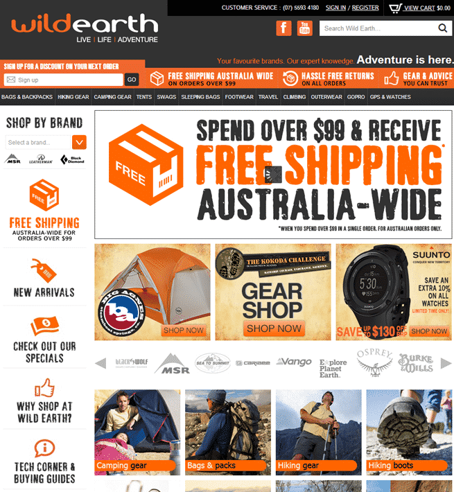
I Particularly Like:
Attractive Quality Design
The home page is brimming with color. So much color! The feature images are bright and attractive. With so much focus on colours, the designers/developers of this store have been able to use very simple typographic effects.
Look at the fonts and you’ll notice that they all look like standard fonts. This can work to your advantage as loading text in a page is faster than loading images, and a fast loading page has a lower bounce rate (people who visit your store and then leave instantly) and search engines like faster loading pages.
Free Shipping
If you’ve ever bought anything from a camping store you’ll know it’s pretty easy to spend over $150. Wild Earth have placed their free shipping offer in the top half of the screen. This prominent placement gives consumers a quick reason for staying in the store and exploring further.
Easy to Use Navigation
Even though the home page is so busy to look at the designers have created a simple 5 column structure. Creating ‘lines’ in design helps viewers to interpret the information. Despite being so busy the design makes it easy to read and subsequently dive into the category areas of content.
Sticky Content
Rather than offering a blog (ho-hum) Wild Earth have a Tech Corner & Buying Guides section. Consumers want to buy from reliable experts, not sellers who drop-ship at the cheapest price out of China.
Although a merchant can be both, the consumer typically wants to buy from someone who they know will sell them the right product.
The Tech Guides are a great way of proving their expertise. If you’re worried about writing content you can pay someone to research and then write the articles for you. oDesk now has a managed writing service called MediaPiston. You can pay per article.
While the prices aren’t the cheapest around, they are a good reliable way of getting content.
I Would Change Or Optimize:
Social Proof
Apart from a tiny little button in the top right corner showing 180 Facebook Likes and a tiny little GeoTrust badge at the very end of the screen, the overall store template does include any social indicators that this business is trustworthy.
I would add a Facebook Like Box to the home page, or in the footer of every page.
This will show site visitors that there are in fact 900+ people following Wild Earth, and they have an active Facebook page which reveals who the co-founders are (Reveals in more ways than one! Va va vooom!) and creates a sense of personality.